How I Designed My Studio Website

After three days of building, tweaking, second-guessing, and moving things five pixels to the left and then immediately back again, my studio website finally started to feel like me.
For a while I had been wanting a place online that felt like a true home for my design work. Somewhere that introduced my studio, reflected my aesthetic, and quietly pointed people toward the branding templates I create.
But every time I started building something, it didn’t quite feel right.
So naturally, I kept redesigning it.
Three days later, after a lot of experimenting with layout, imagery, and typography, the site finally clicked into place.
This is the story of how it came together.
Starting With a Clear Goal
When I first sat down to design the site, I knew one thing pretty clearly.
I didn’t want it to feel like a typical template shop.
There’s nothing wrong with marketplaces like Etsy, but they aren’t really designed to tell your story as a designer. They’re great for browsing products, but not always great for communicating the thinking behind them.
What I wanted instead was a studio introduction.
A place where visitors could quickly understand who I am, the type of design I care about, and the aesthetic philosophy behind the templates I create.
From there, they could move naturally into my Etsy shop to explore the collection.
In other words, the site needed to do three things well:
- Introduce me as a designer
- Show the aesthetic of my work
- Guide people toward the templates.
Once I had that structure in mind, everything else started falling into place.
Designing Around an Editorial Layout
One of the first design choices I made was leaning into an editorial layout style.
Instead of building a typical product page structure, I treated the site more like a magazine spread or design portfolio.
Large typography.Small micro labels.Generous spacing.Very intentional hierarchy.
The oversized name on the homepage became the anchor of the entire layout.
It’s bold, simple, and immediately tells you whose studio you’ve landed in. No scrolling required.
Small labels like Creative Studio and About the Studio help guide the eye without competing with the main headlines. They function more like quiet captions than traditional section headers.
This contrast between large and small elements is something I’ve always loved in editorial design. It creates rhythm on the page and gives the layout room to breathe.
Plus, if you’re going to put your name on the internet, you might as well commit to it.
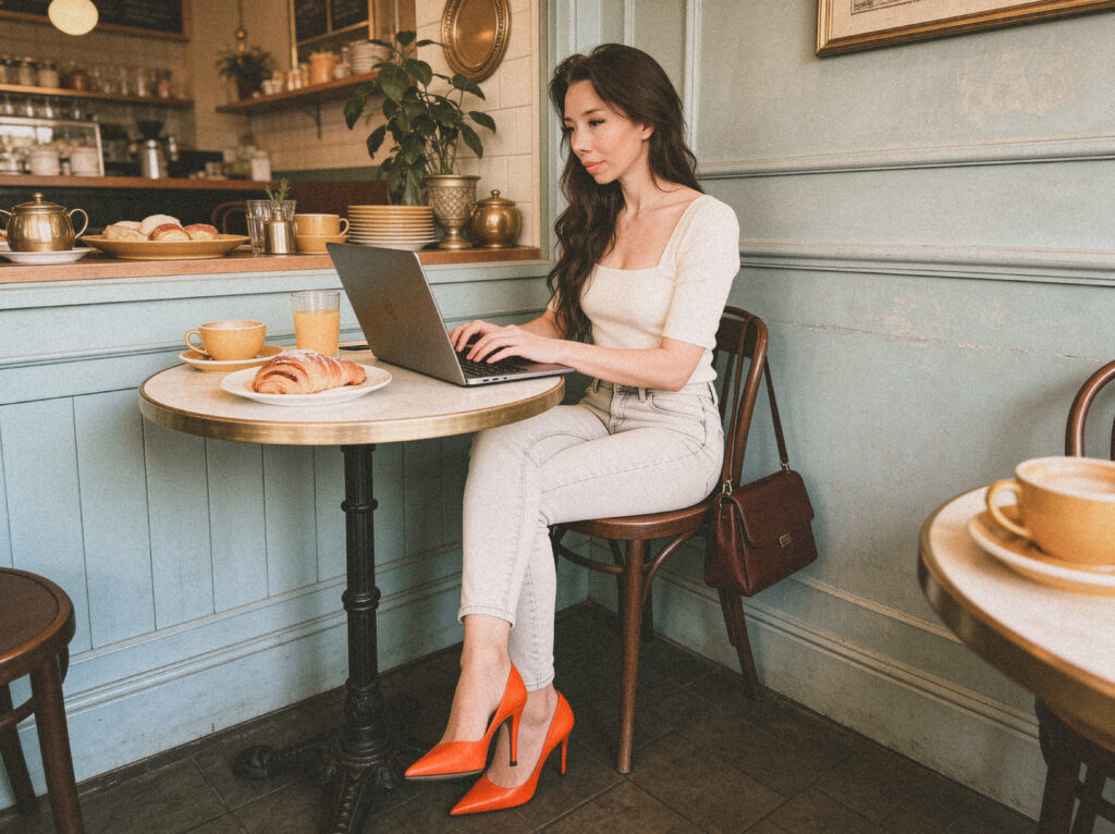
Choosing a Visual Direction
The imagery was just as important as the layout.
I didn’t want typical “designer stock photos.” You know the ones — perfectly clean desks, perfectly symmetrical plants, and someone thoughtfully holding a pencil while staring at a blank notebook.
Instead, I wanted something that felt more like a real creative environment.
That’s where the café scenes came in.
There’s something about café spaces that naturally communicates creative work. Laptops open, notebooks nearby, warm lighting, a bit of ambient noise in the background.
It’s a setting that feels productive but relaxed, which is often exactly where good ideas show up.
The images I chose lean into that atmosphere. They show moments of working, thinking, writing, and building ideas.
They’re a little cinematic, a little editorial, and just imperfect enough to feel real.
And yes, there is a croissant involved, which I feel is an important design detail.
Building a Color System
Another big part of the design was the color palette.
I wanted something warm, grounded, and a little timeless. Nothing overly trendy or loud.
The site uses soft neutral tones as the foundation, which keeps the overall experience calm and uncluttered. From there, deeper burgundy tones anchor the typography and create contrast across the layout.
What I like about this combination is that it doesn’t try too hard. The colors support the design rather than competing with it
And when you’re working with strong typography and imagery, restraint is usually the better design choice.
The occasional pops of color within the photography bring energy into the layout without overwhelming it.
Which, coincidentally, is also how I feel about most branding.
Treating Templates Like Portfolio Work
One of the most important decisions I made on the homepage was how to present the templates themselves.
Instead of displaying them as typical product listings, I approached them like portfolio projects.
Each template appears as a curated visual piece rather than a product card.
That subtle shift changes the perception completely.
Instead of feeling like a store, the section reads like a collection of design work. It reinforces the idea that these templates are thoughtfully built systems, not just downloadable files.
Because even though they’re designed to be flexible and easy to customize, the thinking behind them is still rooted in branding strategy and design principles.
Templates can absolutely be accessible without being generic.
Writing the Copy
Once the design structure was in place, the next step was writing the copy.
I wanted the tone to feel clear, confident, and a little conversational. Not overly polished, but still intentional.
The goal wasn’t to convince people to buy something immediately. It was to explain the studio, the design philosophy behind the work, and why these templates exist in the first place.
The phrase that kept resurfacing while writing was thoughtful design tools for modern businesses.
That really captures the heart of the studio.
Simple systems that help founders create brands that feel cohesive and professional without needing a complicated branding process or a design degree.
Keeping the Site Focused
One of the biggest design decisions I made was actually about what not to include.
It’s surprisingly easy to turn a new website into a maze of pages. Services, resources, newsletters, portfolios, shop pages, and a dozen other things that all compete for attention.
For this site, simplicity felt more powerful.
The structure stays intentionally focused:
- Home
- About
- Blog
- Contact
- Shop
Each page has a clear purpose.
The homepage introduces the studio.The about page shares the story behind it.The blog explores ideas and design thinking.The contact page opens the door for conversation.
And the shop connects everything back to the template collection.
Clean and straightforward tends to age better than complicated layouts.
When the Design Finally Clicked
After a lot of small adjustments, there was a moment when the site finally felt finished.
The typography, imagery, and spacing all started working together instead of competing with each other.
That’s always the moment you’re hoping for in a design project.
When the layout stops feeling like individual pieces and starts feeling like a cohesive environment.
At that point, the site wasn’t just a place to link my Etsy shop anymore.
It became the digital home for my studio.
Which is exactly what I had been trying to build all along.
Explore the Template Collection
If you’re building a brand and looking for thoughtfully designed templates, you can explore the full collection inside my Etsy shop.
Each template is created to be flexible, modern, and easy to customize.
Because good design should help businesses move forward, not slow them down.
And ideally it should also save you from spending three days redesigning your website.
Although, to be fair, sometimes that’s part of the fun.
TL;DR
• I spent three days designing my studio website until it finally felt like me.
• The goal wasn’t to build a typical template shop, but a studio introduction.
• I leaned into an editorial layout with large typography and lots of whitespace.
• Café-inspired imagery helped create a creative, real-world atmosphere.
• The color palette stays warm and minimal so the design feels calm and timeless.
• Templates are presented like portfolio work instead of product listings.
• The site keeps things intentionally simple and guides visitors to my Etsy shop.
Sometimes the best design decisions are the ones that make things simpler.
Leave a Reply
You must be logged in to post a comment.
Hi, this is a comment.
To get started with moderating, editing, and deleting comments, please visit the Comments screen in the dashboard.
Commenter avatars come from Gravatar.